The date picker can be customized using the unity inspector:
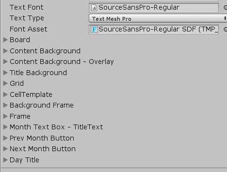
Each item corresponds with a visual element of the DatePicker.
Board
the board settings apply to the date table.:
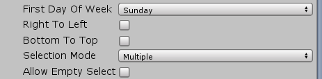
- FirstDayOfWeek – The first day displayed on the board
- Right To Left – makes the board right to left
- Bottom to top – inverts the bottom and top days of the board
- Selection mode – Singular , Multiple or range modes are supported
- Allow Empty Selection – true to allow empty selection. Otherwise the current day is selected by default
Cell Template
The cell template controls the colors of the each cell in the board:
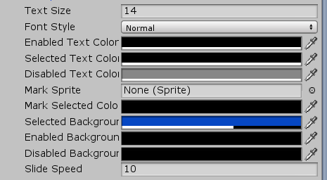
- Text Size – the text size of the each cell
- Font style – the font style of each cell
- Enable/Selected/Disabled Text Color – The text color for each of the stated modes
- Enable/Selected/Disabled Background Color – the background color for each of the stated modes
- Slide speed – the color change animation speed. The higher the value the faster the color will slide
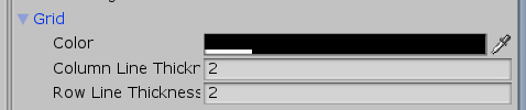
Grid
Controls the grid of the board:
DAte Formats
All the date formats following the standard c# date formatting rules , see this page.